
Keyben
Branding
About the project:
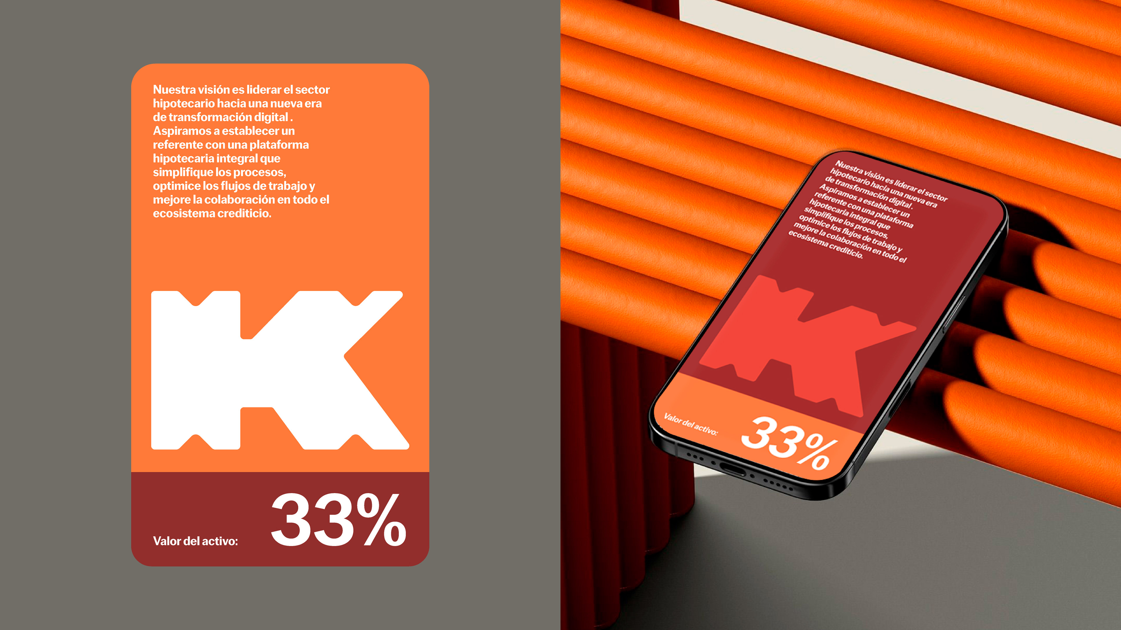
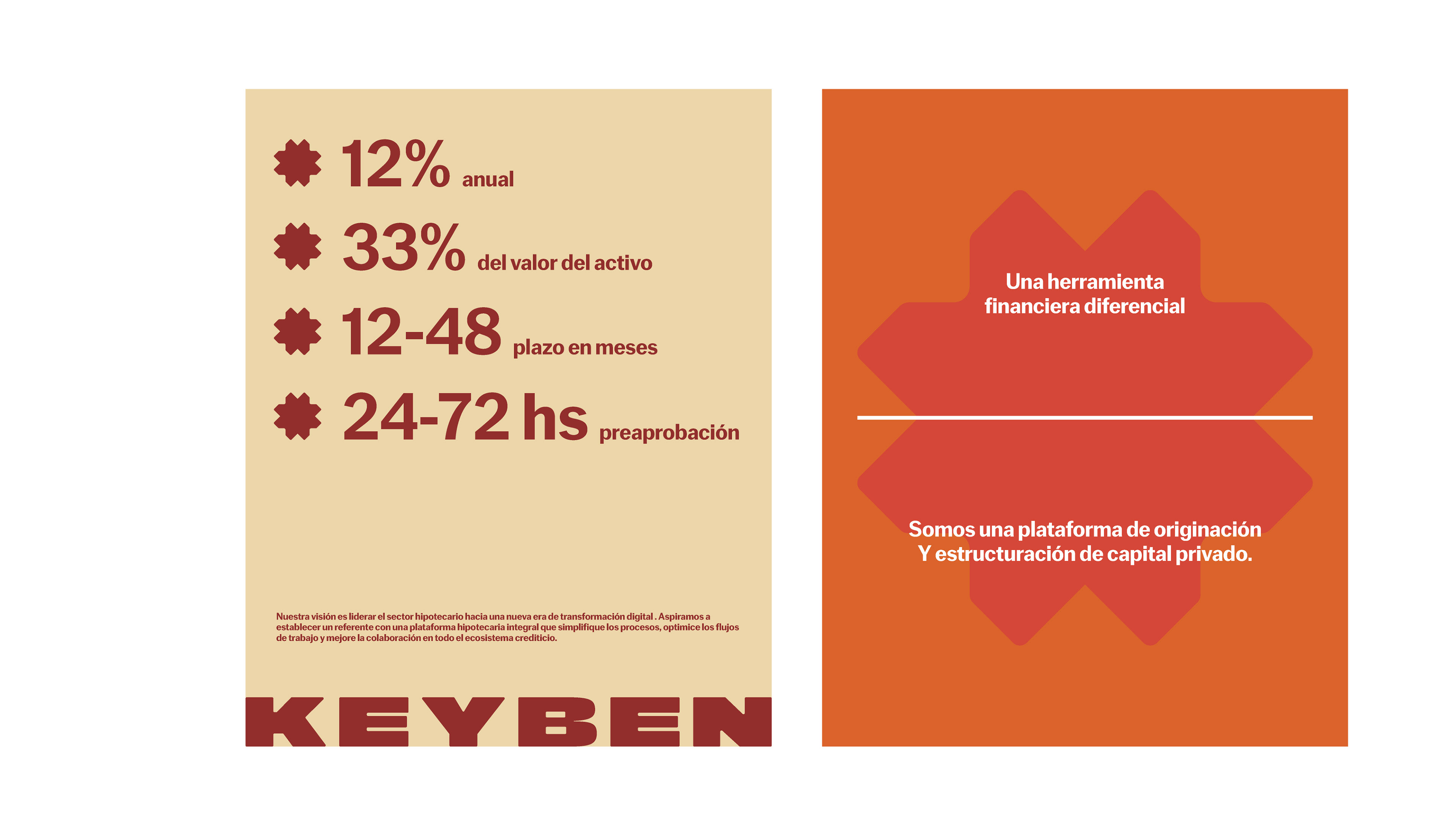
It's a platform that connects private capital with property buyers through mortgage loans. Our vision is to lead the mortgage sector into a new era of digital transformation. We aspire to set a benchmark with a comprehensive mortgage platform that simplifies processes, optimizes workflows, and improves collaboration across the entire lending ecosystem.
About the branding:
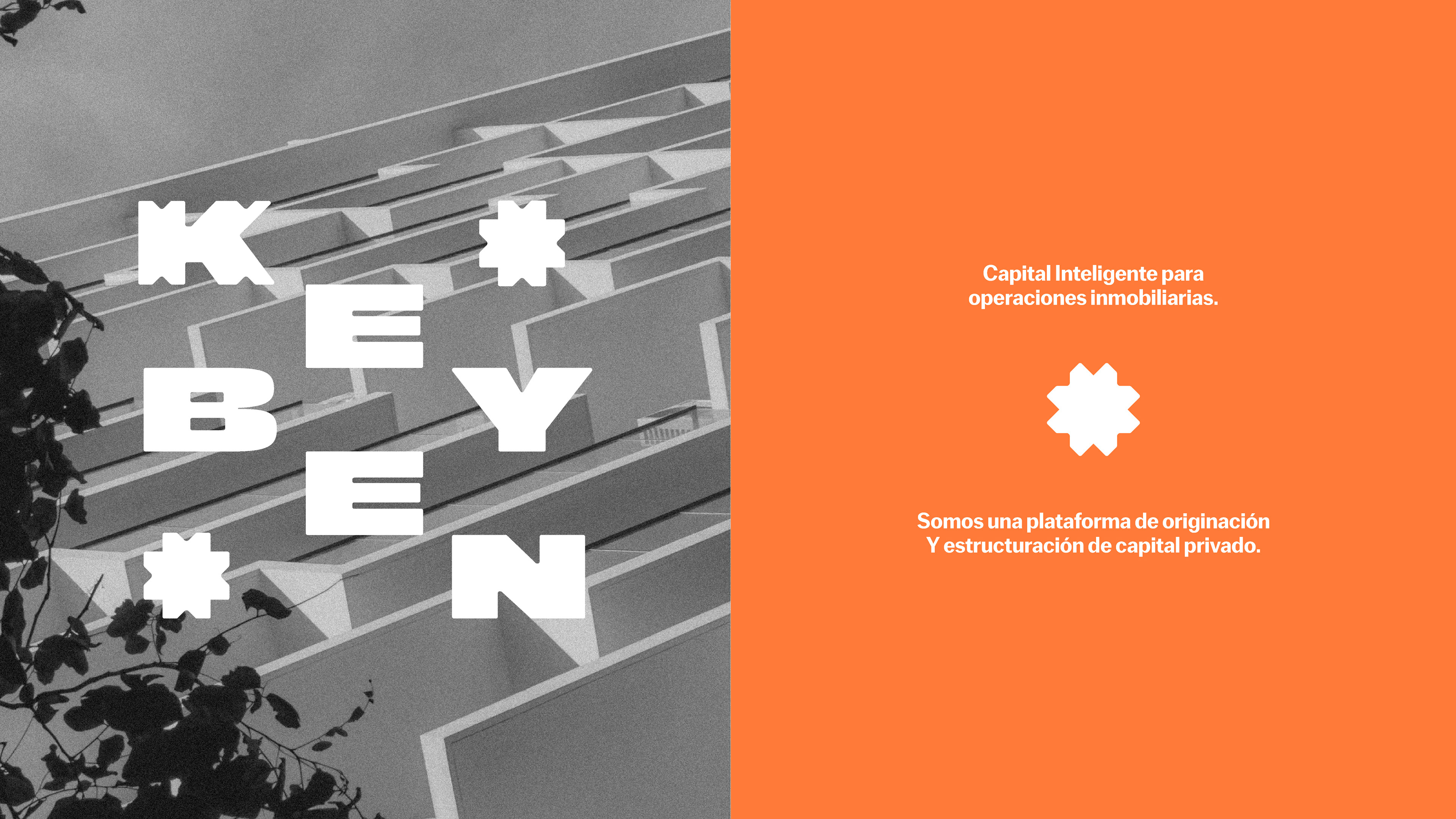
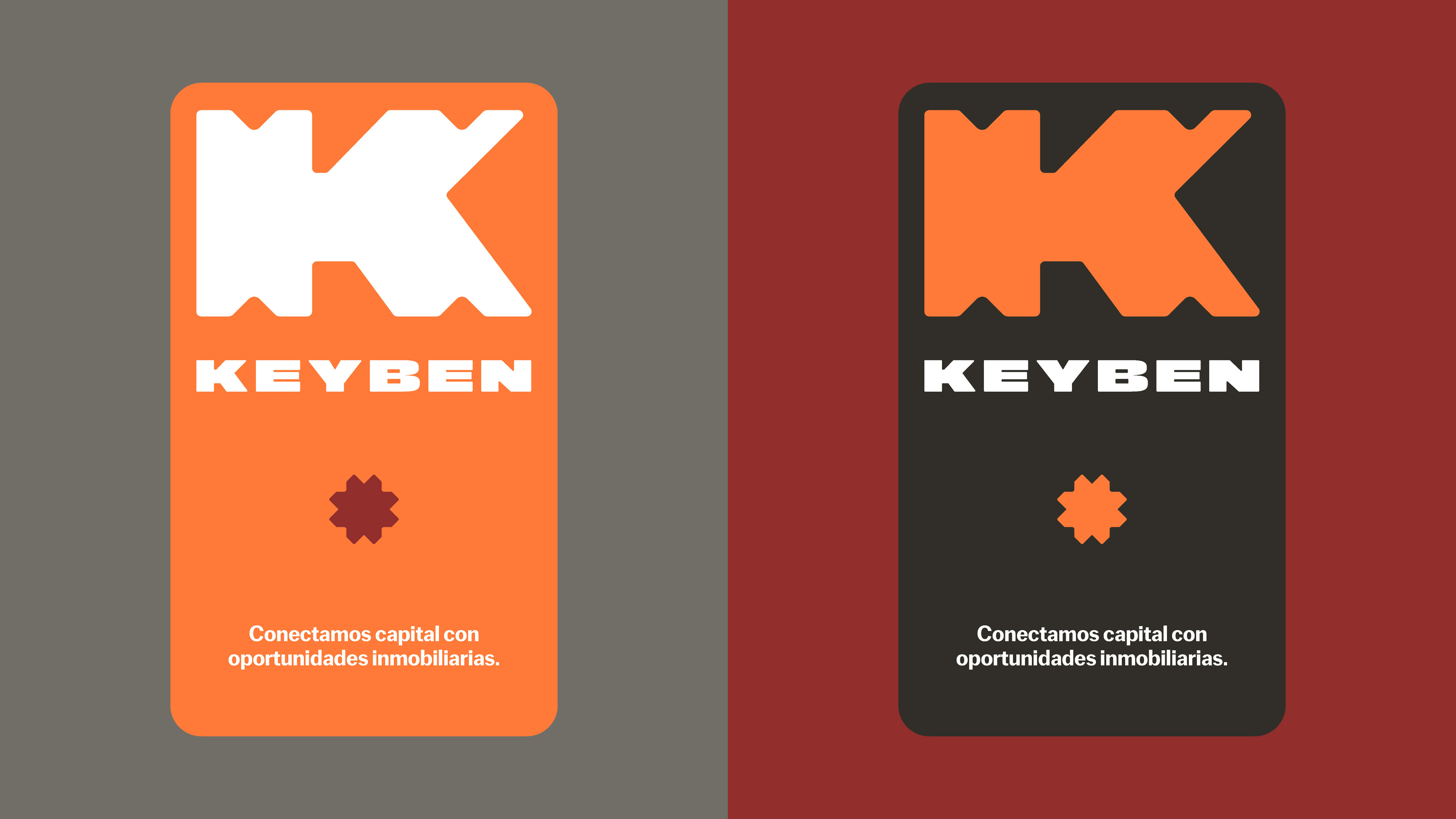
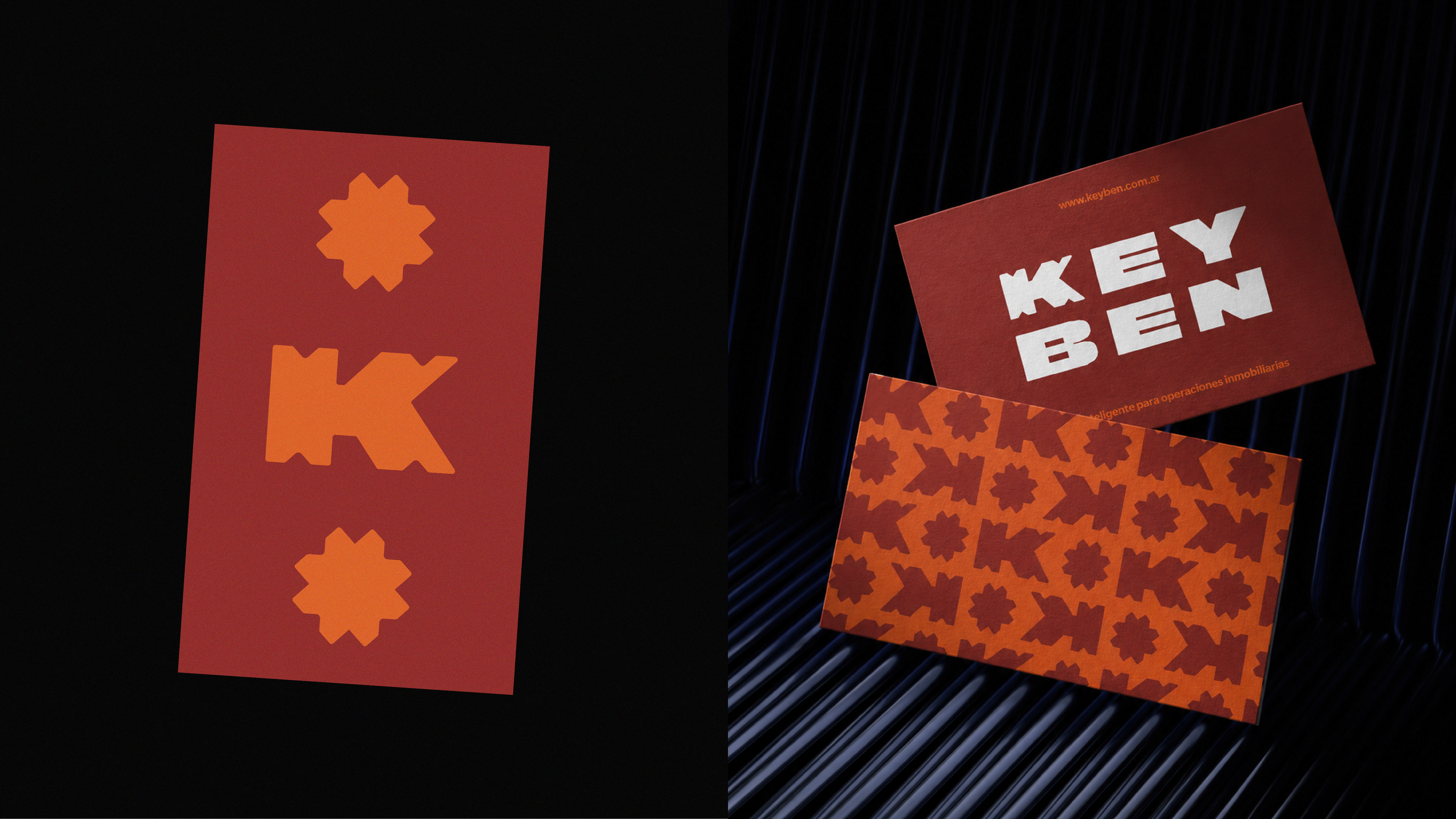
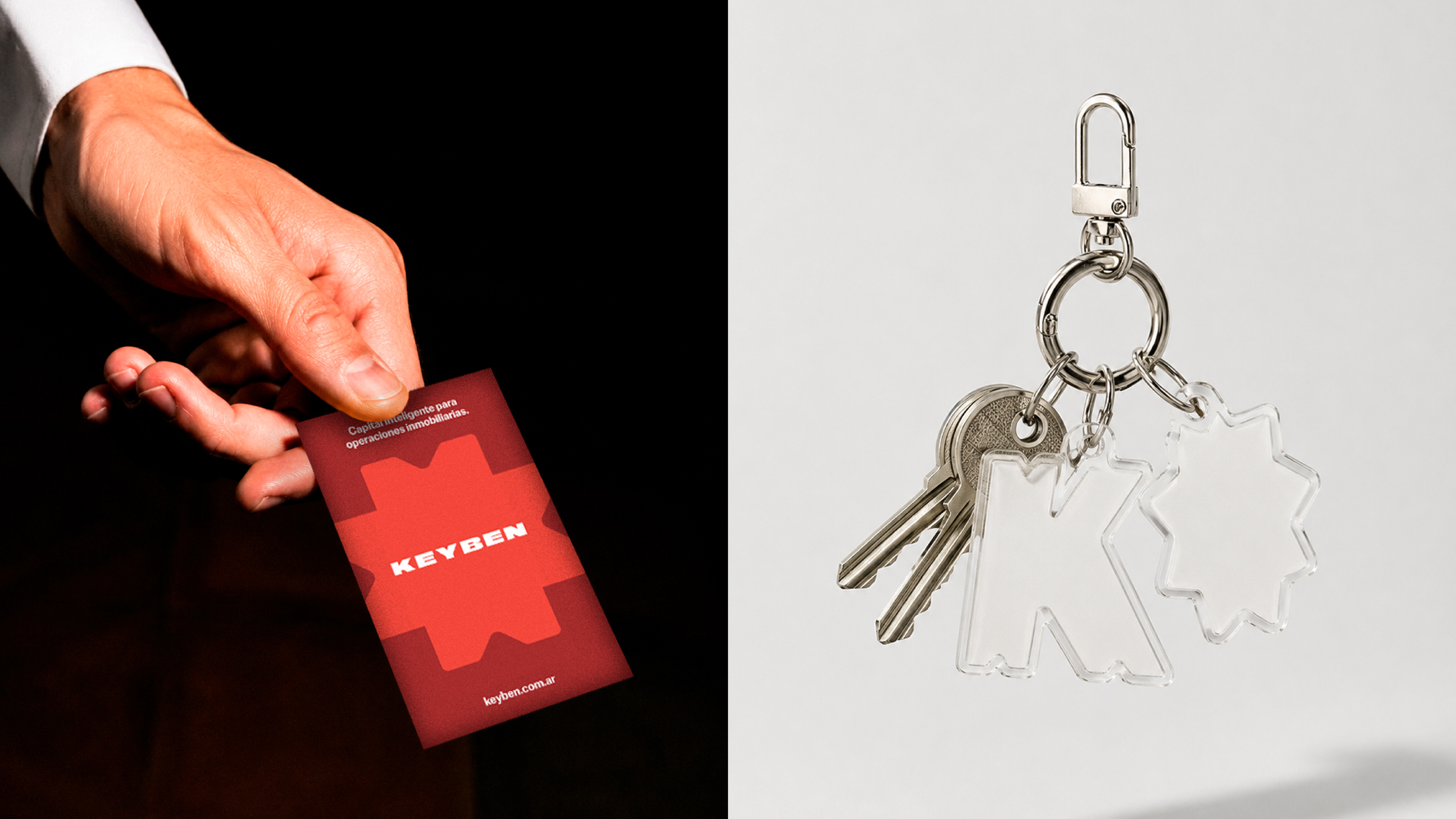
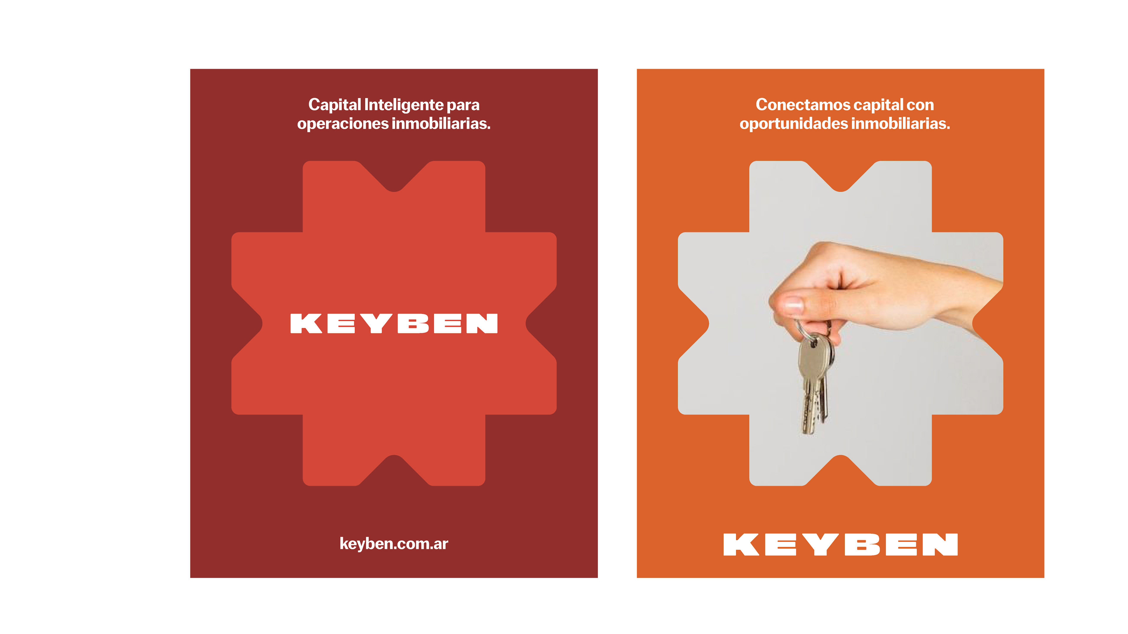
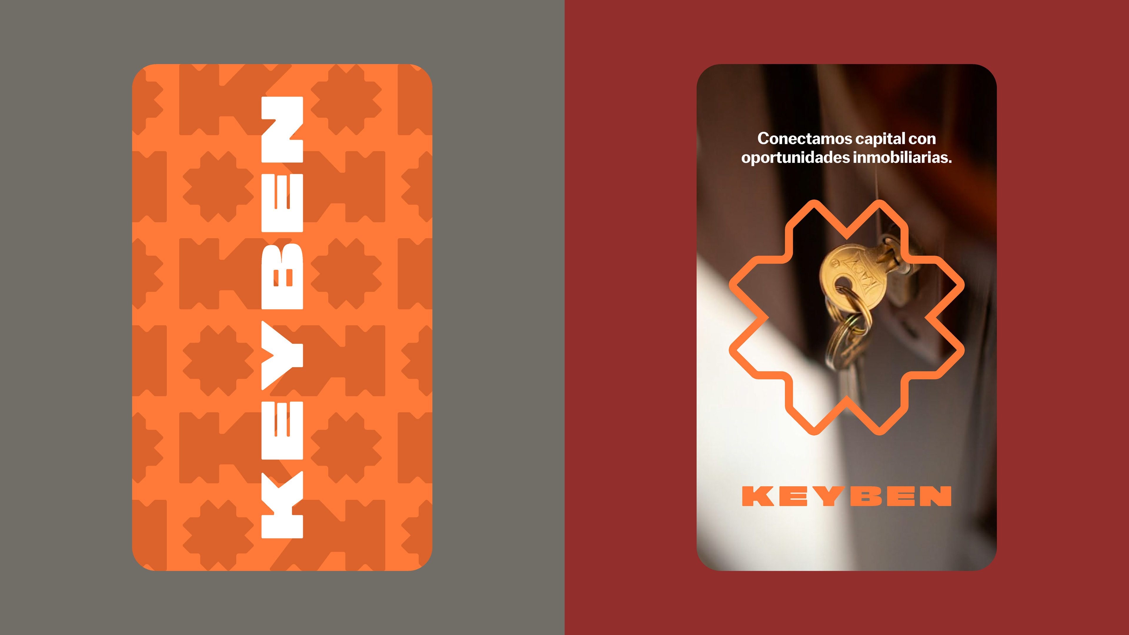
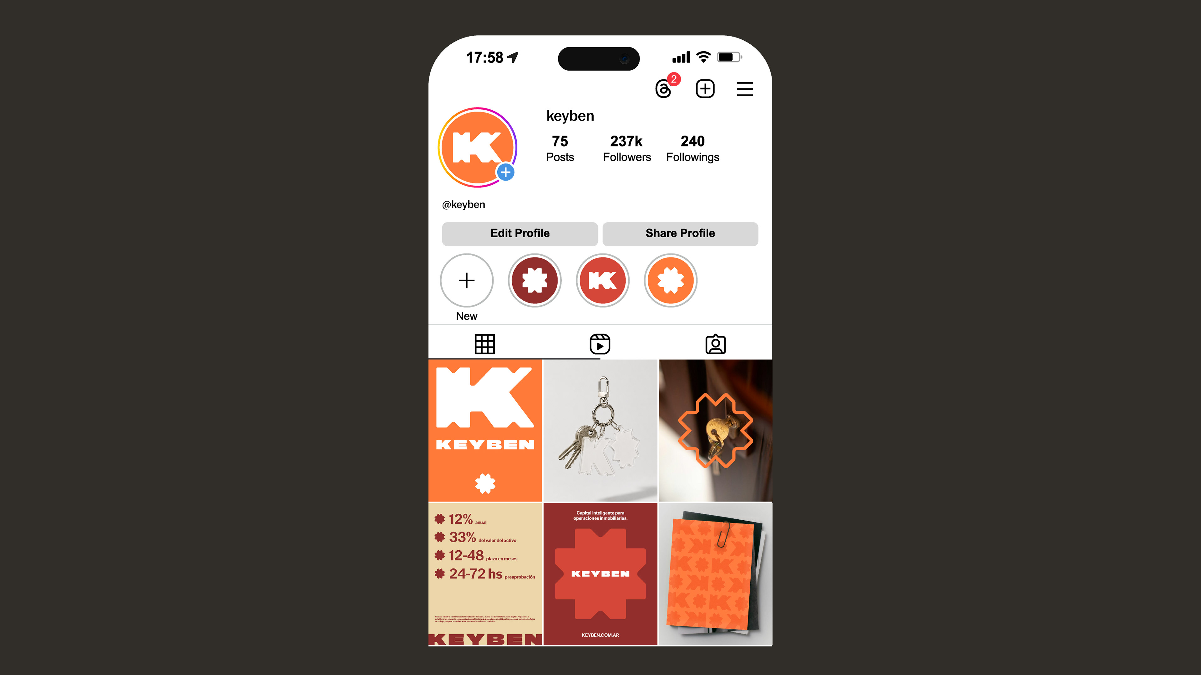
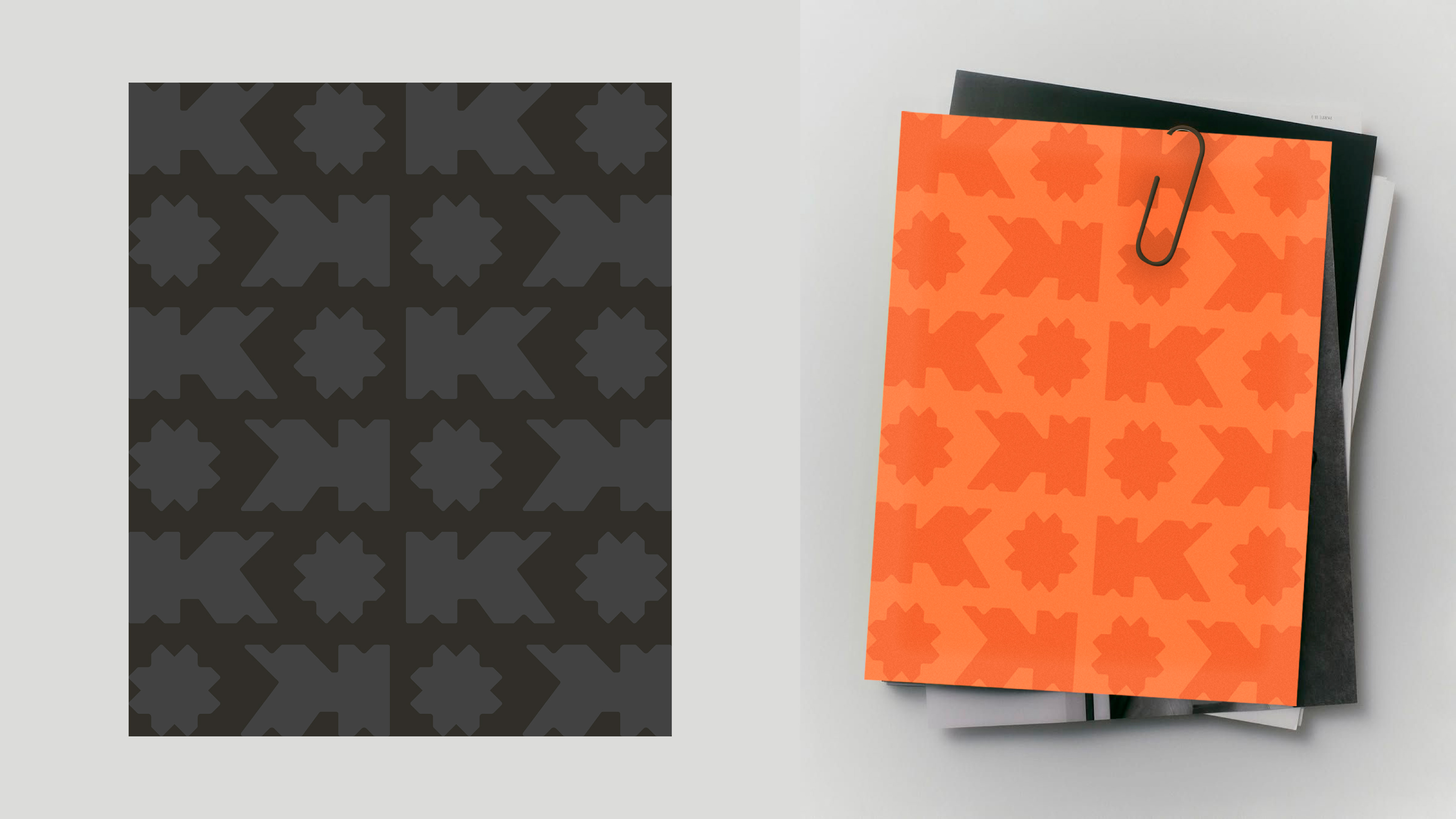
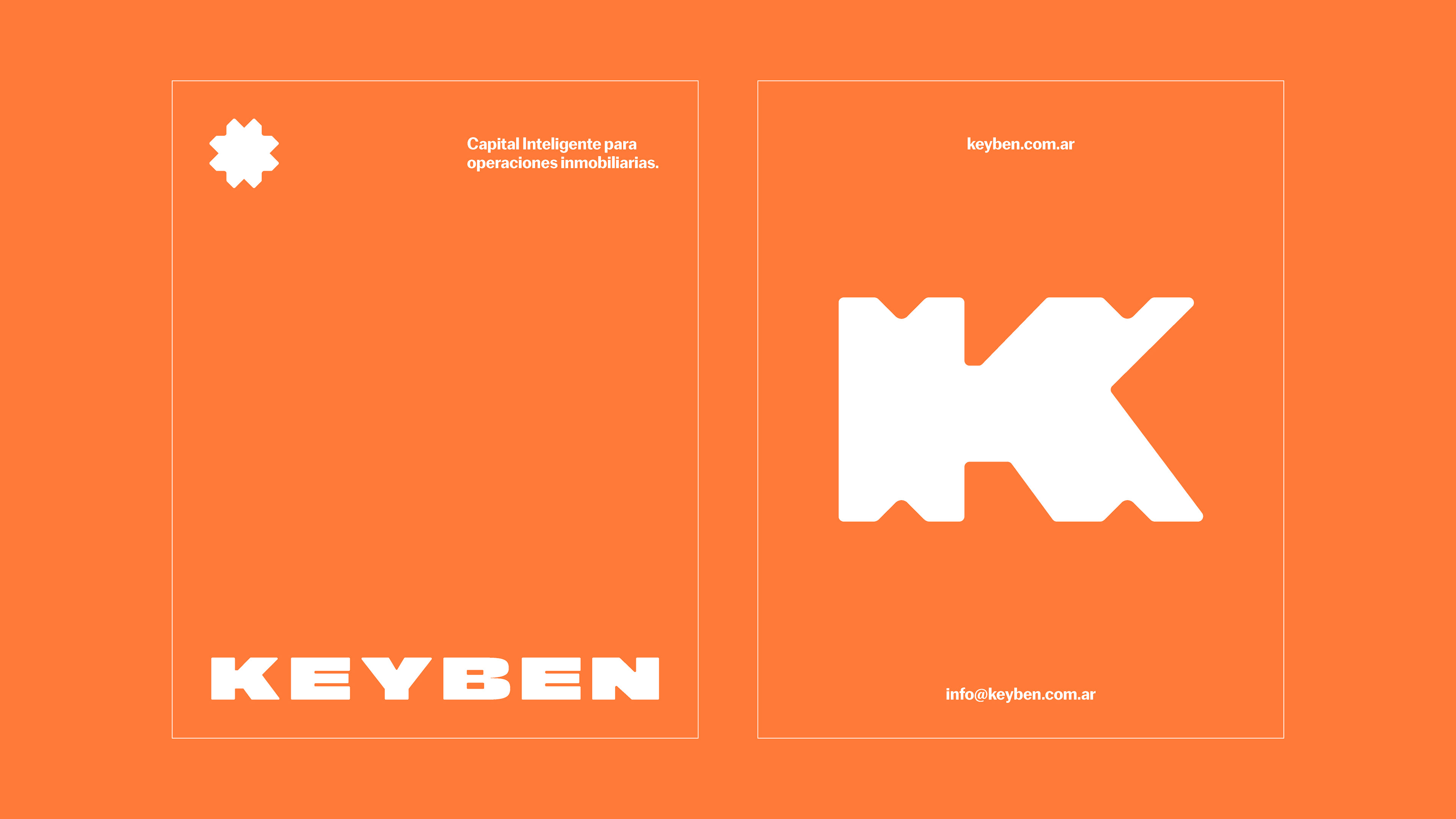
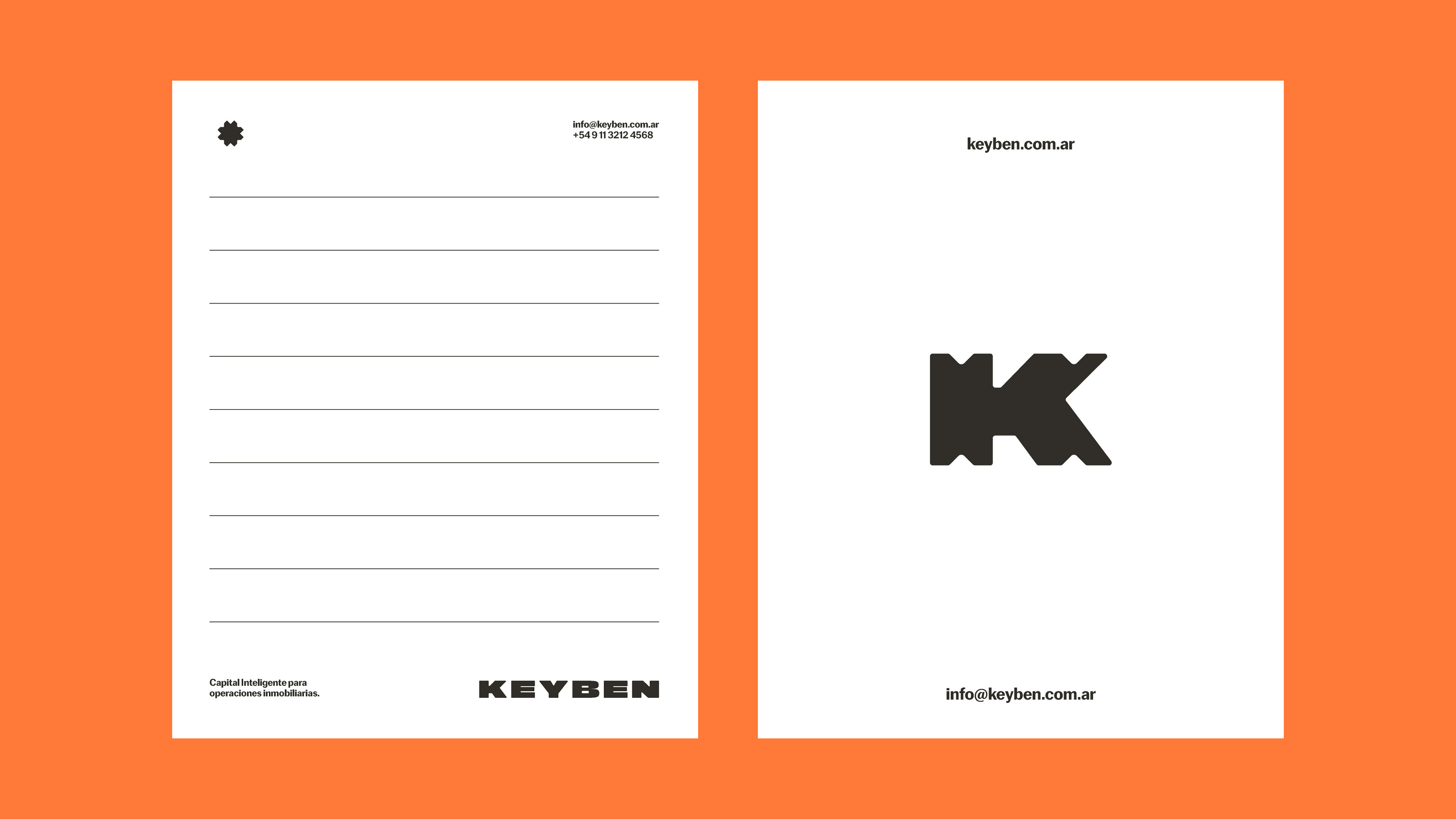
The palette uses warm colors: orange as the primary color in two shades, accompanied by cream and burgundy, complemented by white and a grayish black. This combination reflects the sector: construction, projection, bricks — through a striking, contrasting, and intense palette. As for the logo, the starting point was the word "Key": the key to your new home. That concept is captured in the main icon, a K built from geometries, symmetries, and repetition, which also works as a brand system, allowing for the creation of patterns, shapes, backgrounds, and variations to explore across different applications. The asterisk emerges from one part of the K, mirrored, whose diagonals naturally generate that gesture.
Creative Direction and Design: Macarena Fatne
Project Manager: Julieta Enriquez
Typography: (Fer Cozzi) Cofo (Contrast Foundry)